|
My mentor's name is Allie, and she is a senior at Apex. Allie took Art 1 and Sculpture, and loved the classes. She decided that she wanted to continue art throughout high school, and now she is in Art 4. Allie was unsure about art at first, but after really enjoying her sculpture class she said she loved the tight-knit group and enjoyed the way the classes work.
Her blog URL is http://allie-apex-2017.weebly.com Allie and I have decided that we both the same things from the mentor/mentee program. We want to make a good friend, and I would love for her to help me improve my art.
0 Comments
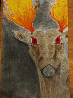 For the two-in one project, I decided to morph a deer with fire (as antlers). I came up with this idea when I was looking at pictures of a man-made fire in California that burned down one of my favorite places. So the basic idea behind this piece is geared towards wildlife in wildfires. In this piece, I first did a pencil sketch. I then started on project paper with a light colored pencil outline. I did the darkest parts first, and then moved to the lighter parts. Finally, I did the background with charcoal. This is where it became difficult, as it is hard to make a smooth layer of charcoal without accidentally darkening the deer or fire. Although it looks spotty, I wanted the charcoal to represent smoke from the fire, so I was okay with it not being perfectly smooth. If I did this project again, I may change the medium. I had a lot of trouble adding value with colored pencils and making the fire look realistic. If I did this, I think I would use watercolor paint. The watercolors would make the fire and background smoother and more realistic. I would be able to add value more easily. Although I would change aspects about this piece, overall I believe that I did a good job challenging myself. I have learned that it is not easy to draw animals with fire! 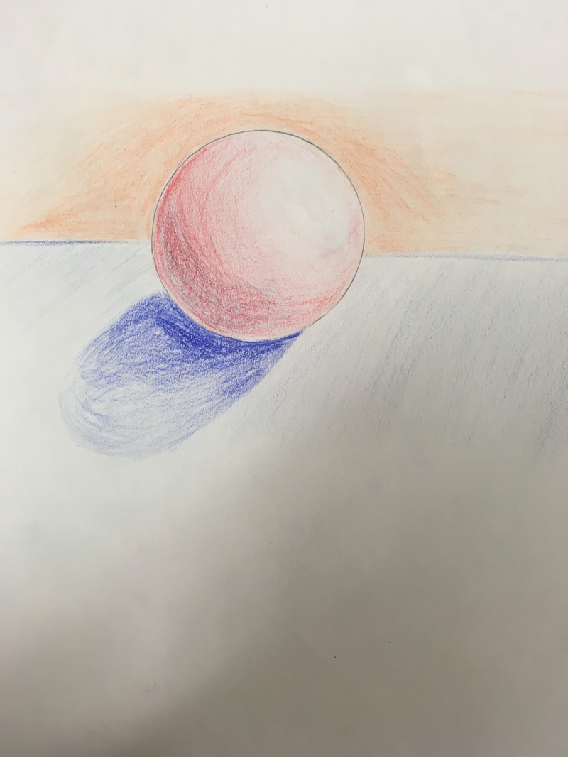 The most useful warm up that I did for the two-in-one piece was the colored pencil sphere with value. This helped me learn how to add value with colored pencil before I did it on the end project.
The warm up that I learned the most from during this unit was the sphere shading. In this warm-up, I really learned how to shade seamlessly, using layering techniques. I also learned about the parts of a shaded sphere: the highlight, midtone, core shadow, and reflected light. Before we learned this, I had never thought about how the sphere would have a reflected light on the bottom, off the surface of what it is sitting on. Doing this warm-up helped me think more about how objects really look, not just how I think they would be shaded. 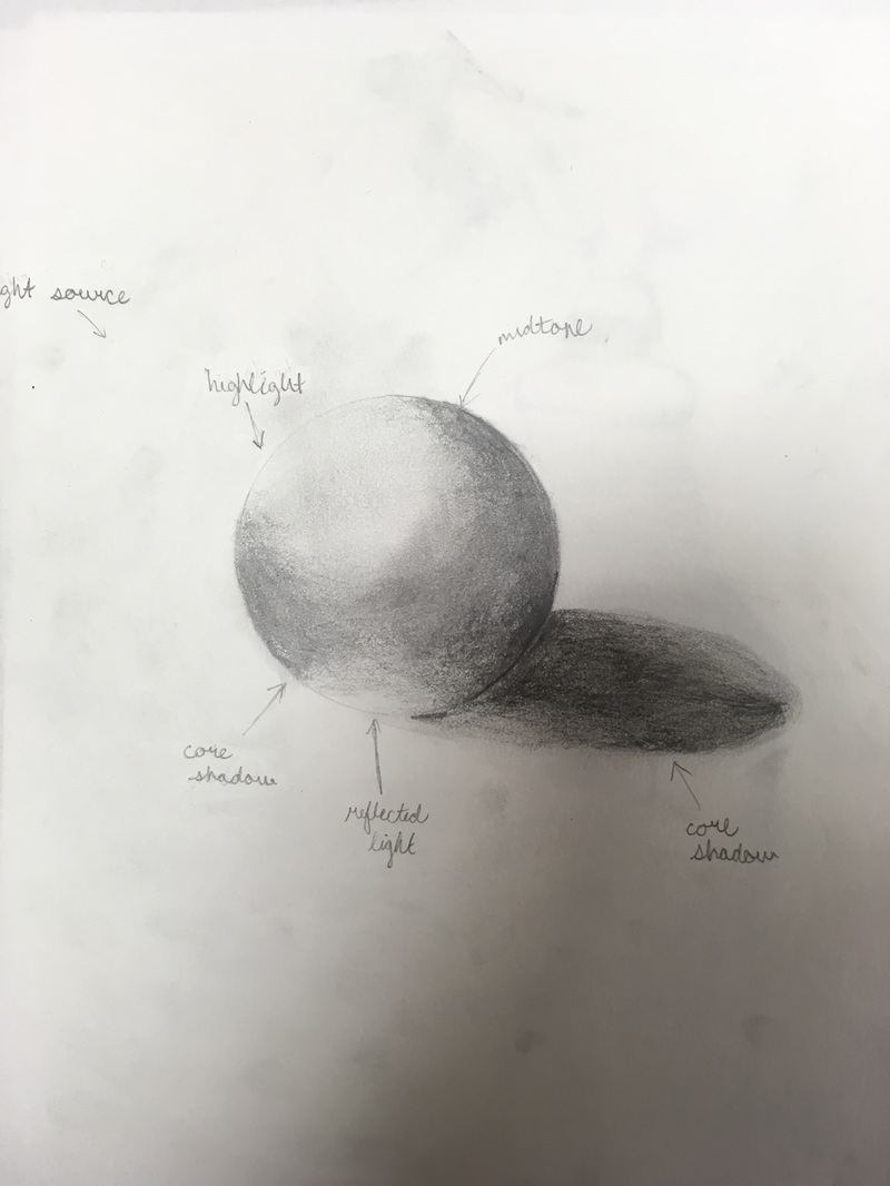 The next sketch is my pencil drawing. This was the first observational drawing that we did. Pencil is my favorite medium so far, because making mistakes has an easy fix. I am able to erase, but sometimes erasing just makes ugly marks. It is harder to blend than others mediums. 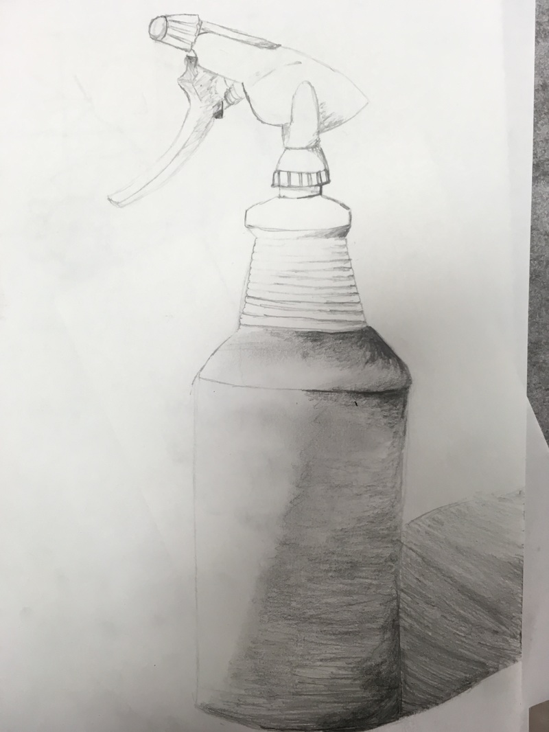 My charcoal drawing is one in which we were able to trace in pencil, and then go back over in charcoal. Though I like the way charcoal looks dark and intense, it is difficult to work with. An advantage and disadvantage all in one is that you can get rid of mistakes by blending the charcoal in with the rest, but that can also become an issue when you are trying to make permanent lines. It is easy to smear and accidentally get rid of work, but overall I liked the way my drawing came out. 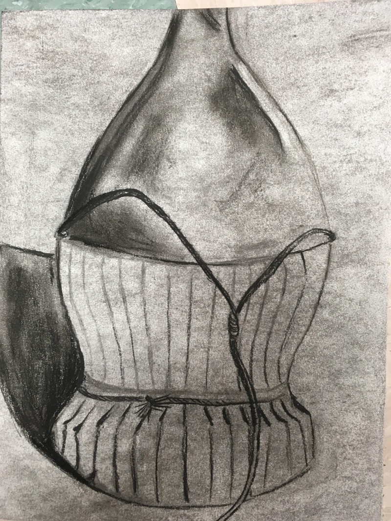 My shoe pen drawing was interesting, as we started with only contour line drawing. I was afraid to start with the pen, because it is so permanent! SO instead of going straight into pen, I first drew the contour lines in pencil. After this, we were allowed to add value. The shoe I chose was slightly difficult to add value to because it had many ruffles with different shadows. Overall I think I did a good job challenging myself. I could add more value next time, but for the first pen drawing I believe this is a good start. 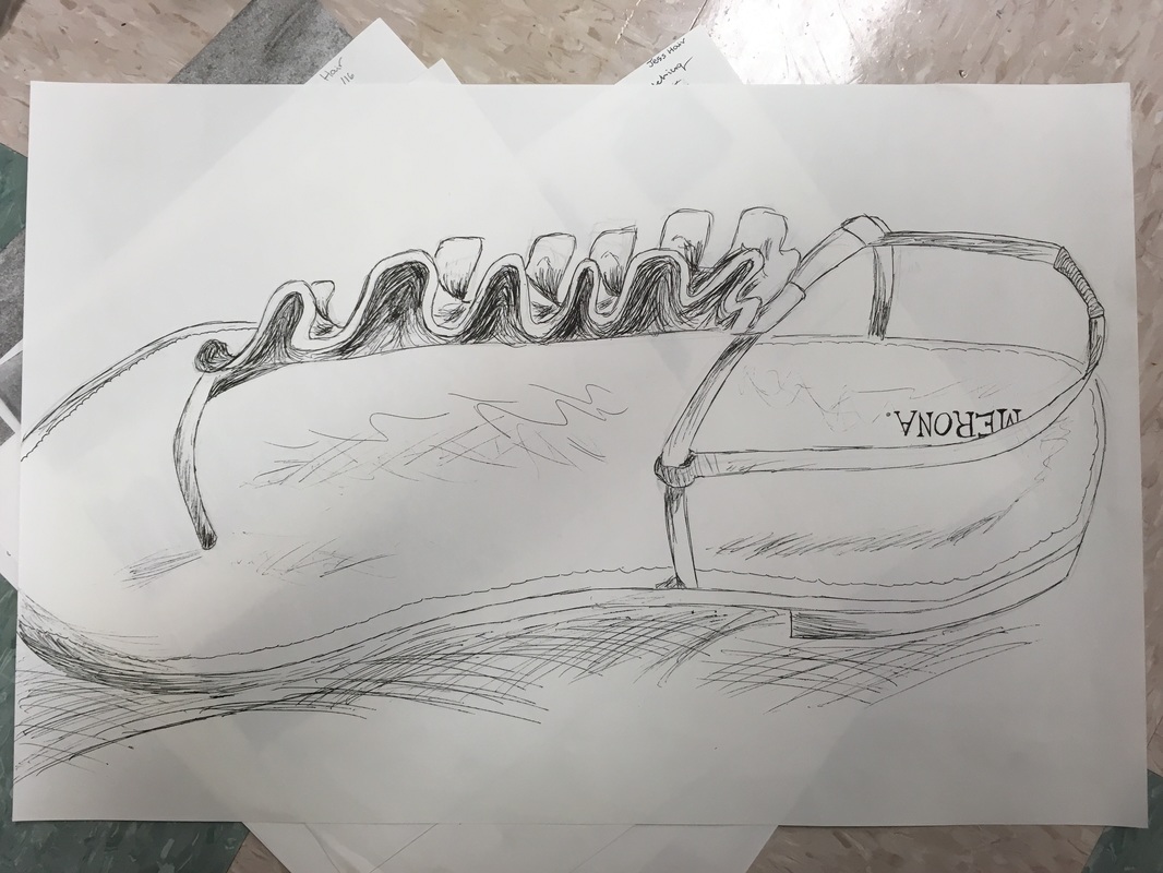 James Nizam is not an average artist. He does a variety of work; some of his pieces are based solely on light, while others are photographs of light and landscape projections onto different types of walls, and some are more like sculptures. He is so inspiring to me because he is able to think so "out-of-the-box" and creatively. Nizam is able to make the simplest things mean so much more by the way he portrays them in his artwork. He does not need beautiful landscapes and fancy objects to make his art beautiful. The way he uses space and light are very unique. I think it is so cool that he is able to imagine and create such brilliant visuals, and something I aspire to do is be more creative like this. One thing I want to be able to do is have people look at my artwork and be able to ponder the meaning of it; Nizam's work is designed so beautifully that it makes me contemplate what it could mean in relation to the world and myself. 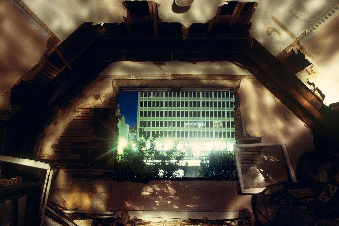 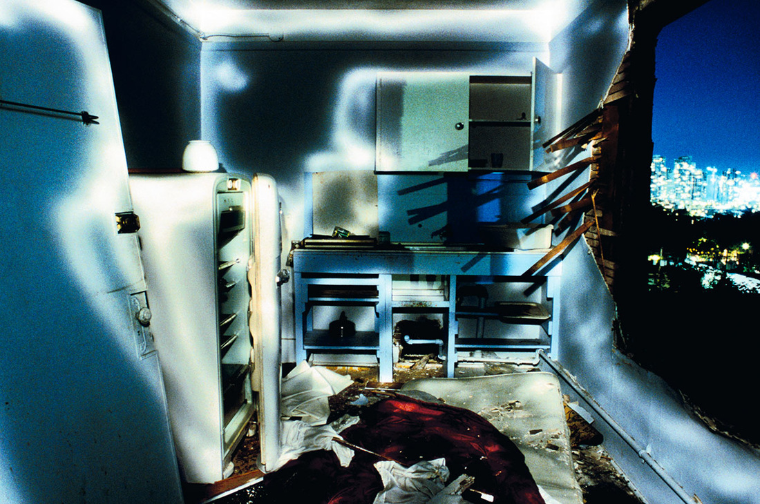 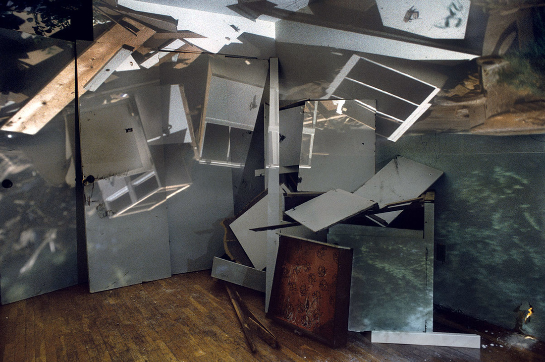 I love the way the light and space is used in these works. 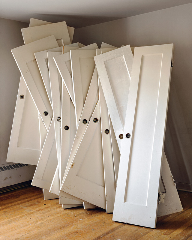 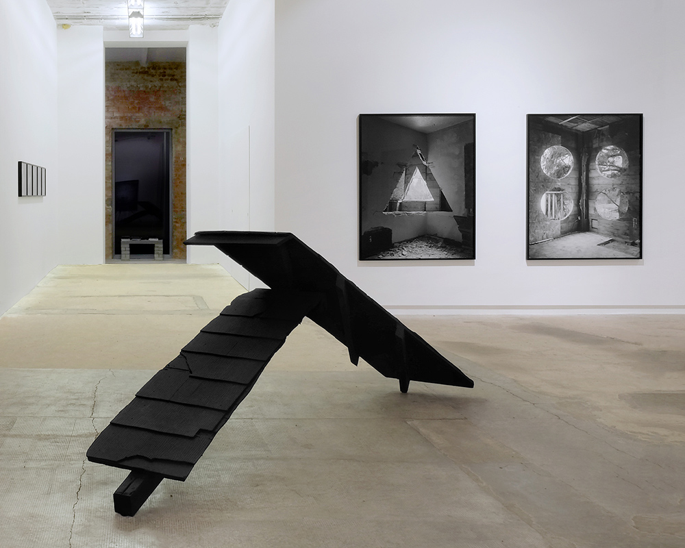 The use of contrasting colors and vacant ambiance is very interesting. 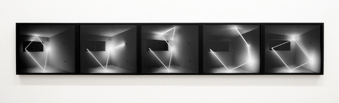 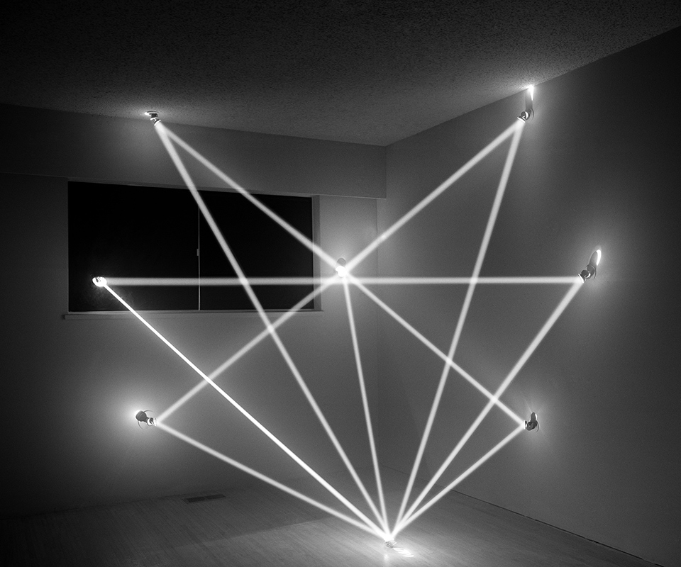 I just love these because it is such a modern, creative form of art. The radiance is beautiful and eye-catching. 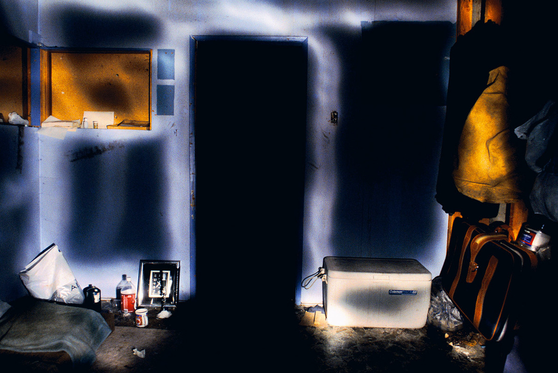 This image is by far my favorite because it is so meaningful. There are so many possible ways to interpret this.
|
AuthorWrite something about yourself. No need to be fancy, just an overview. Archives
January 2017
Categories |
 RSS Feed
