|
The art criticism process: 1. Describe the piece. 2. Analyze, using the elements and principles learned in art. How was the piece made? 3. Interpret. What is the artist trying to say or convey to the viewer? Consider the style and inner meaning. 4. Evaluate the piece. How successful is it? 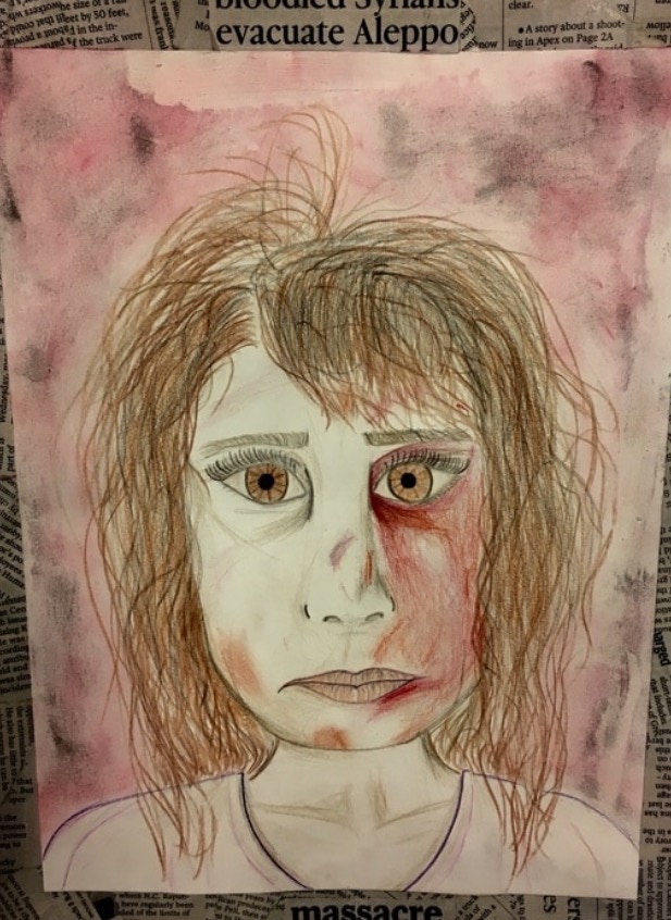 "massacreThis piece was done after a unit of learning how to draw proportional portraits. For the portrait itself, I used pencils, colored pencils, and oil pastels. For the image background I used oil pastels, and for the frame I used newspaper cutouts. As I stated earlier, this piece was very centered on correct proportion. I used the face of the girl to be the center of the viewer's attention by placing it directly in the center. The portrait is balanced because the face takes up almost the whole page. The value and color work together to show the bruises and scarring on the face, creating a distressed look. Since I didn't use color to show the actual skin tone, the red bruises and the value/lines are emphasized. I, being the artist of this piece, was trying to convey a message that would provoke sympathetic emotions of the viewer. I attempted to do this by making some of the words in the frame larger, such as "bloodied Syrians evacuate Aleppo" and "massacre". As I stated earlier, the blank skin tone brings out the physical bruises and scars on the girl's face. In this piece, I was trying to focus toward the emotions of the Syrians being evacuated from Aleppo. As you can see, the refugee's face is almost emotionless. This makes the viewer think about how a long exposure to violence can change people - especially children. This piece is somewhat successful. I believe I was able to convey that the portrait was of a Syrian refugee, and that she was distressed. It was able to get the message across. One thing I may do differently next time is make the face look more realistic, as it almost looks cartoon-ish. This aspect takes away from the reality of the issue. Maybe to make her look less like this, I would use full color colored pencils (color in the whole face), or stick to black and white. I will also add more value. Overall, this piece was successful in portraying the main idea, but could do better with touch-ups. 1. What is art? I believe that art is a man-made work that was made to convey a meaning and provokes emotion/s in the viewers. Some people disagree on what art is and what art isn't, but I believe it is different to everyone. This goes with the quote "beauty is in the eye of the beholder." There is no real way to classify works as either, art or not art, so it is up to the "beholder" to decide. For example, this sketch that I did can be interpreted many different ways. To me, this is art because I know the meaning and work behind it. Interpreted by others, this may have no significance at all and look like a minute-long scribble.  2. What is the point of this class? What did you get out of it? I believe the point of this class is to let students explore a different skill or open up their creative side. Instead of pounding information into our heads like many other classes do, art 1 allows students to learn by doing, rather than listening. We are able to use experiences instead of lectures to explore the world of art. Out of this class, I was able to relax and become more creative. I thought outside of the box, and was able to express my emotions through my art. Besides learning specific skills (as you can see in my picture below- learning how to shade a circle), we learned overall new ways to express art. 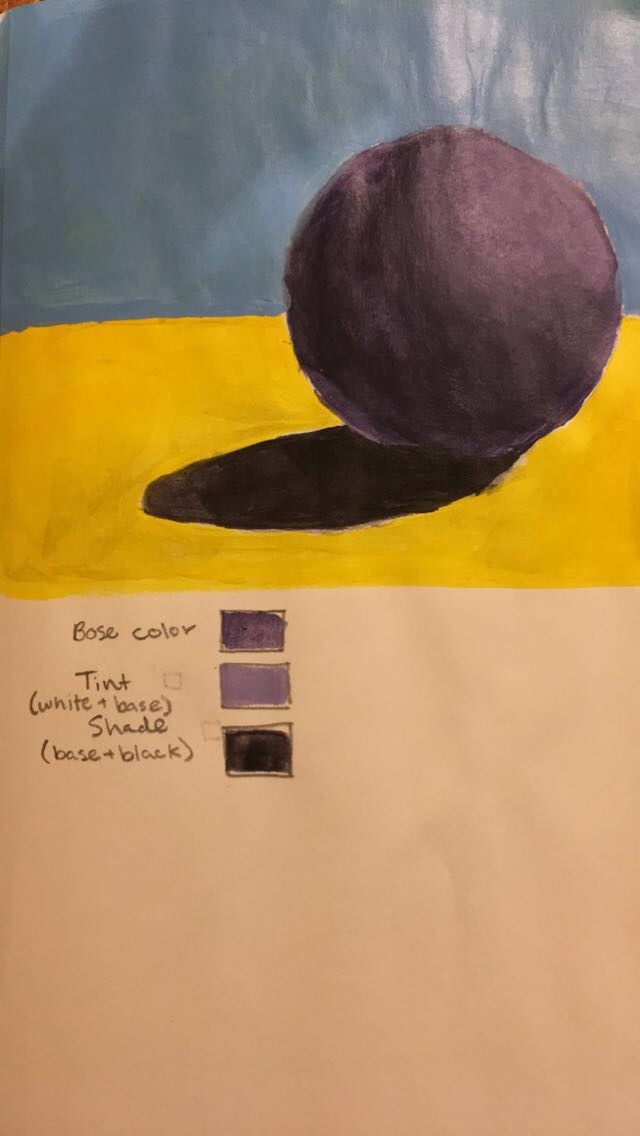 3. Sketchbook: pick any warm-up from your sketchbook that you found beneficial, interesting or simply felt you handled well. Describe the activity and reason for selecting it above the others. The warm-up that I believe I handled well and found beneficial was the hand drawing. This warm-up helped me learn how to draw from observation instead of memory. I also had to pay extreme attention to detail, and I think I succeeded in this. My hand looks detailed and realistic, because I used the line/contour skills that I had previously learned as well. 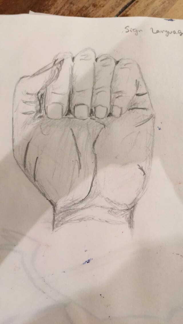
0 Comments
For this project I chose to do cinemagraphs involving horses and their movements. This project, although it seems easy, was actually quite a long process to figure out. It took me at least three days of class time to figure out how to make these. In order to successfully create a cinemagraph, multiple pieces of the image must be completely separated, and the camera must stay completely still when shooting the video. If I was to do this again, I would take more videos, because there are so many cool things you can take videos of horses doing! 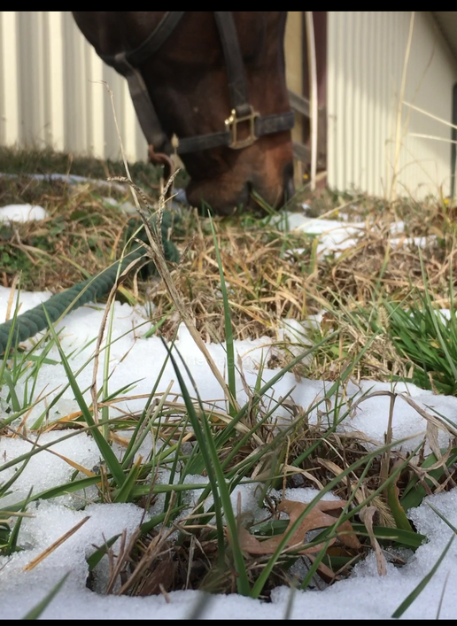 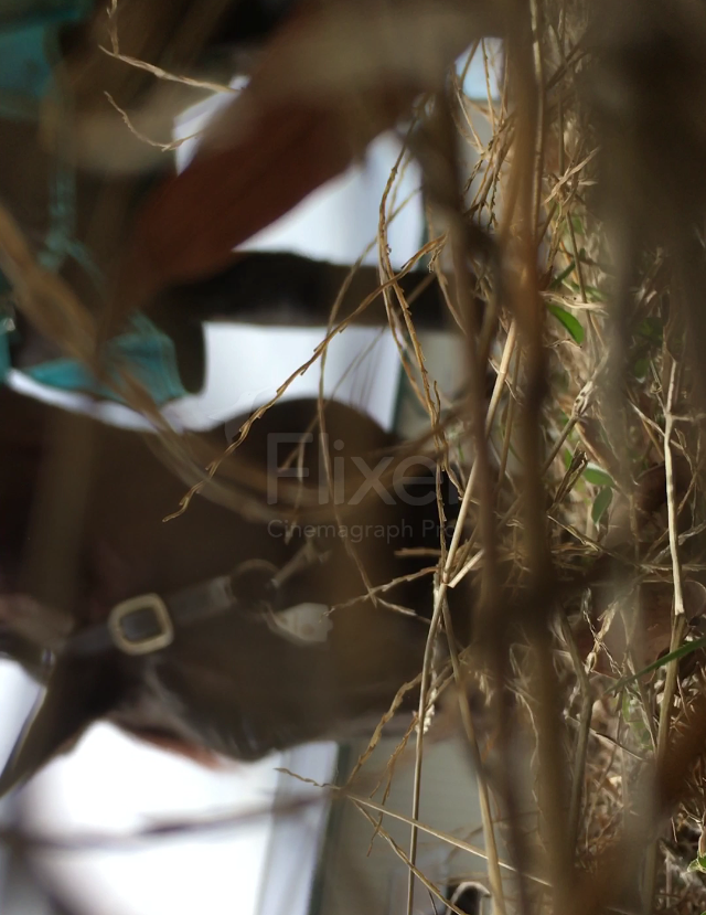 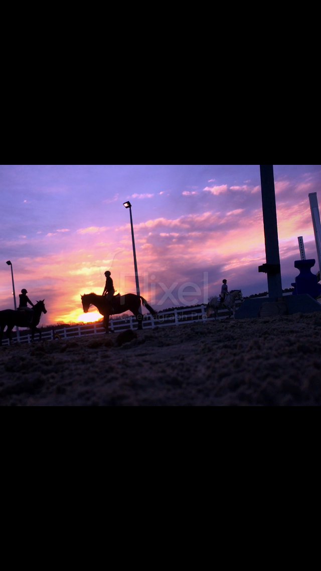 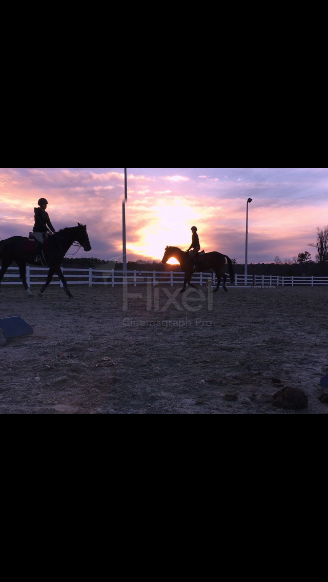 Danai made this piece. She used braille paper, colored pencils, and paint. Her painting is done, but took many days of work and creativity to make. 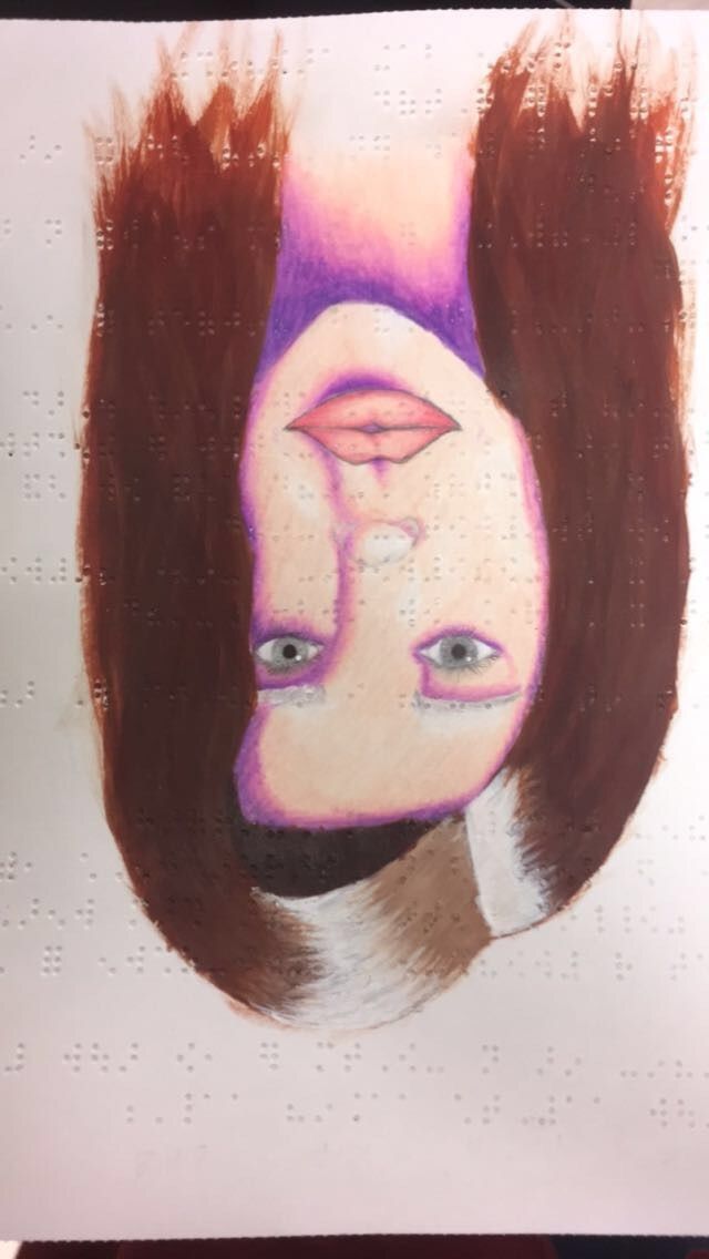 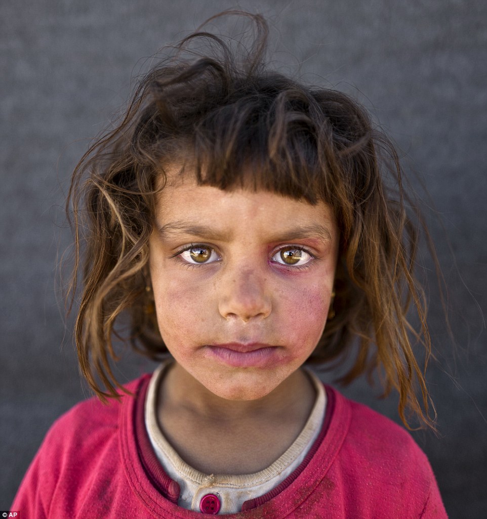 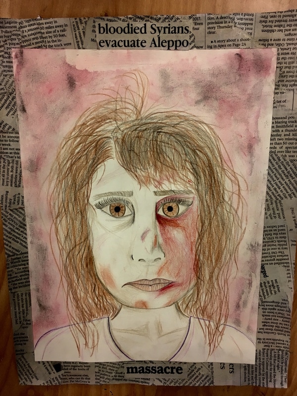 For this portrait, I chose to use a portrait of a Syrian refugee. The Aleppo news had been at a high at the time that I had started this portrait, so I wanted to do something in relation to this tragedy. I chose this picture and began by sketching the face with correct proportions and lines. I did this twice, and then began the real thing. For the real piece, I used pencil for the face outline, colored pencil for the hair, face, and shirt, oil pastel for the background, and newspaper for the frame. I wanted people to be able to look at the piece and automatically understand the issue I was trying to portray.
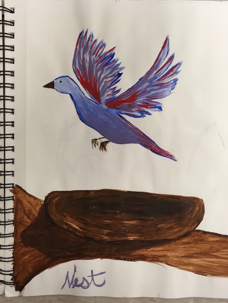
The artist that inspires me comes from South Africa and goes by the name of "Faith 47" or Faith XLVII. She is unique and different because she uses her skill to paint majestically beautiful images on the sides of buildings and inside abandoned buildings. The locations she chooses for each one are in often poverty-stricken places, and the art brings attention to these. It creates something beautiful and memorable out of a depressing and lonely scene. I think my favorite part about this artist is that she is so modest. Instead of doing her artwork in large-scale places and getting paid to do her work, she mostly does this without showing a face or being able to sell her pieces. The artwork itself is truly amazing, the way she is able to paint such large pieces over different textures and make it look so realistic. She chooses mostly animal and human scenes and they all look extremely realistic. Her artwork is shown on buildings internationally. This includes India, USA, UK, Italy, Taiwan, Germany, South Africa, France, China, Tahiti, Canda, Austria, Sweden, Tunisia, Scotland, Madagascar, Puerto Rico, Spain, Israel, Greece, Slovakia, Netherlands, Brazil, Belgium, and Kenya. https://faith47.com/7-83-hz/ 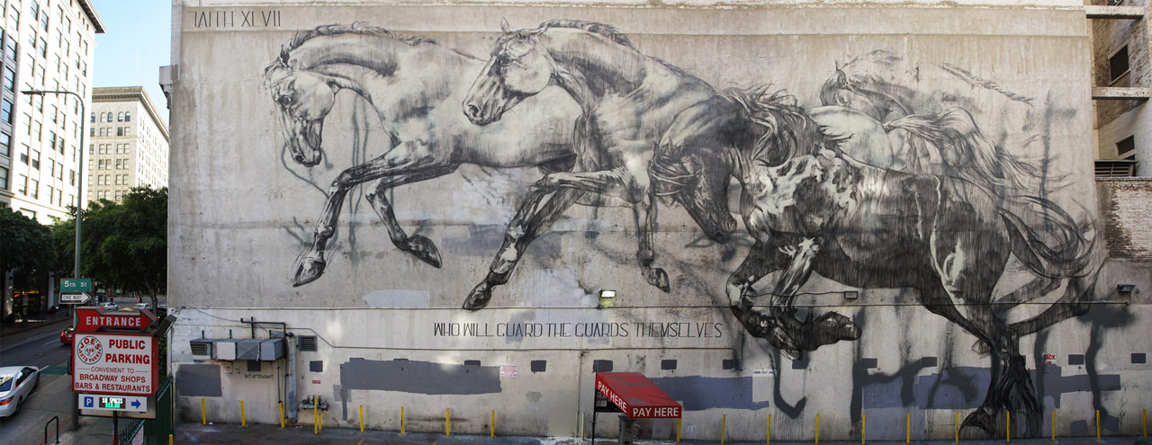 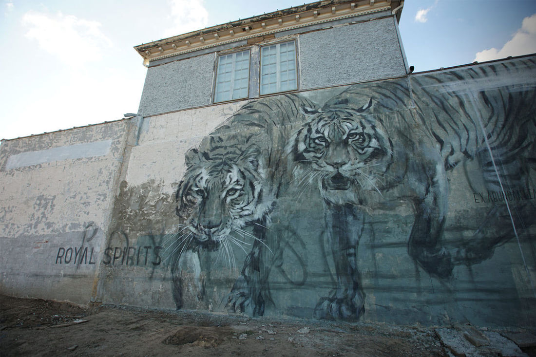 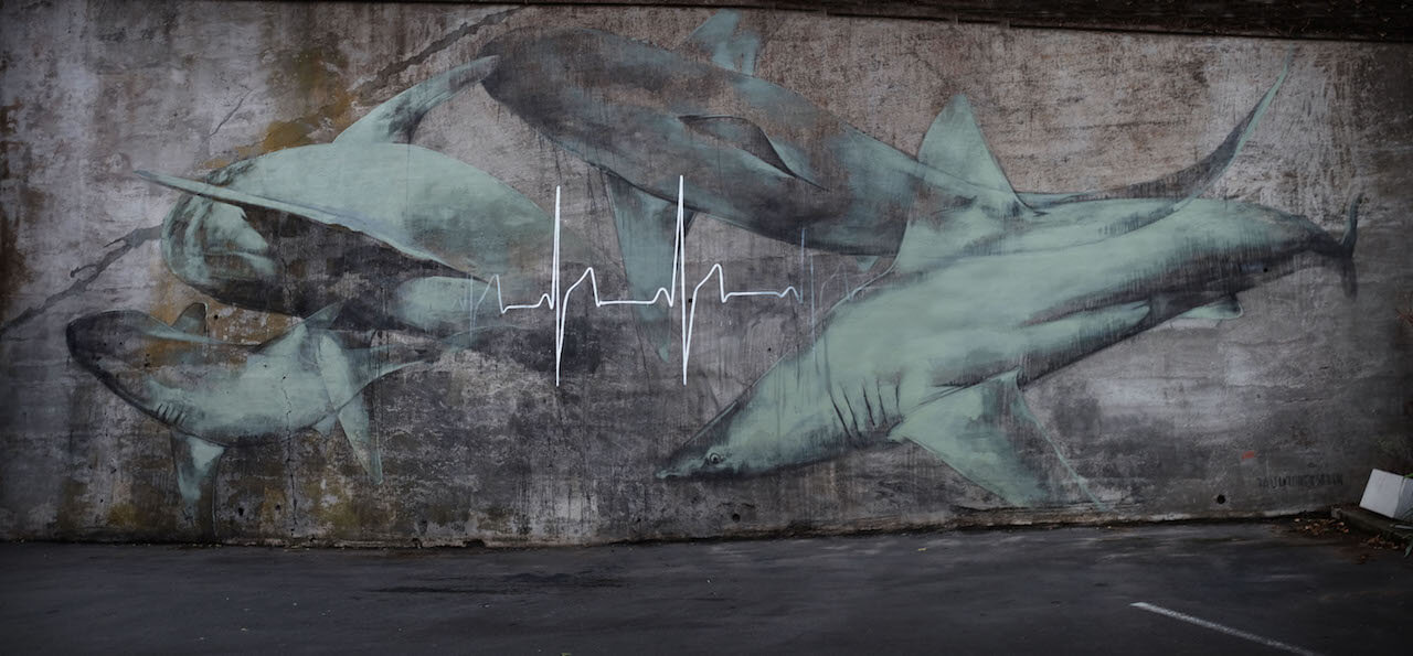 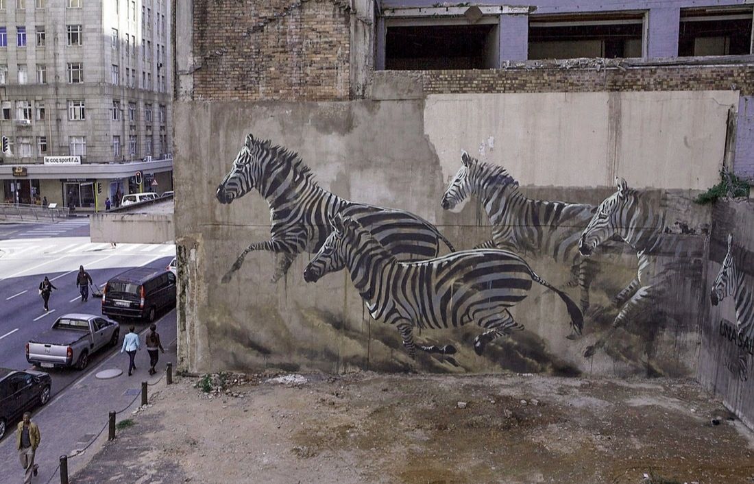 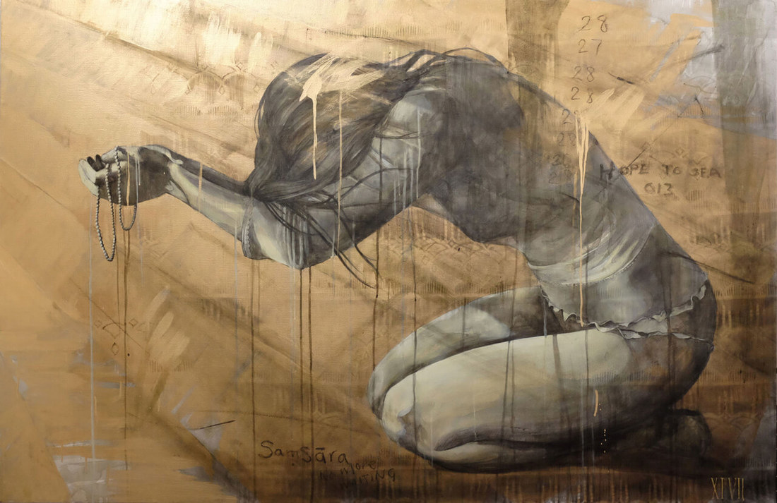 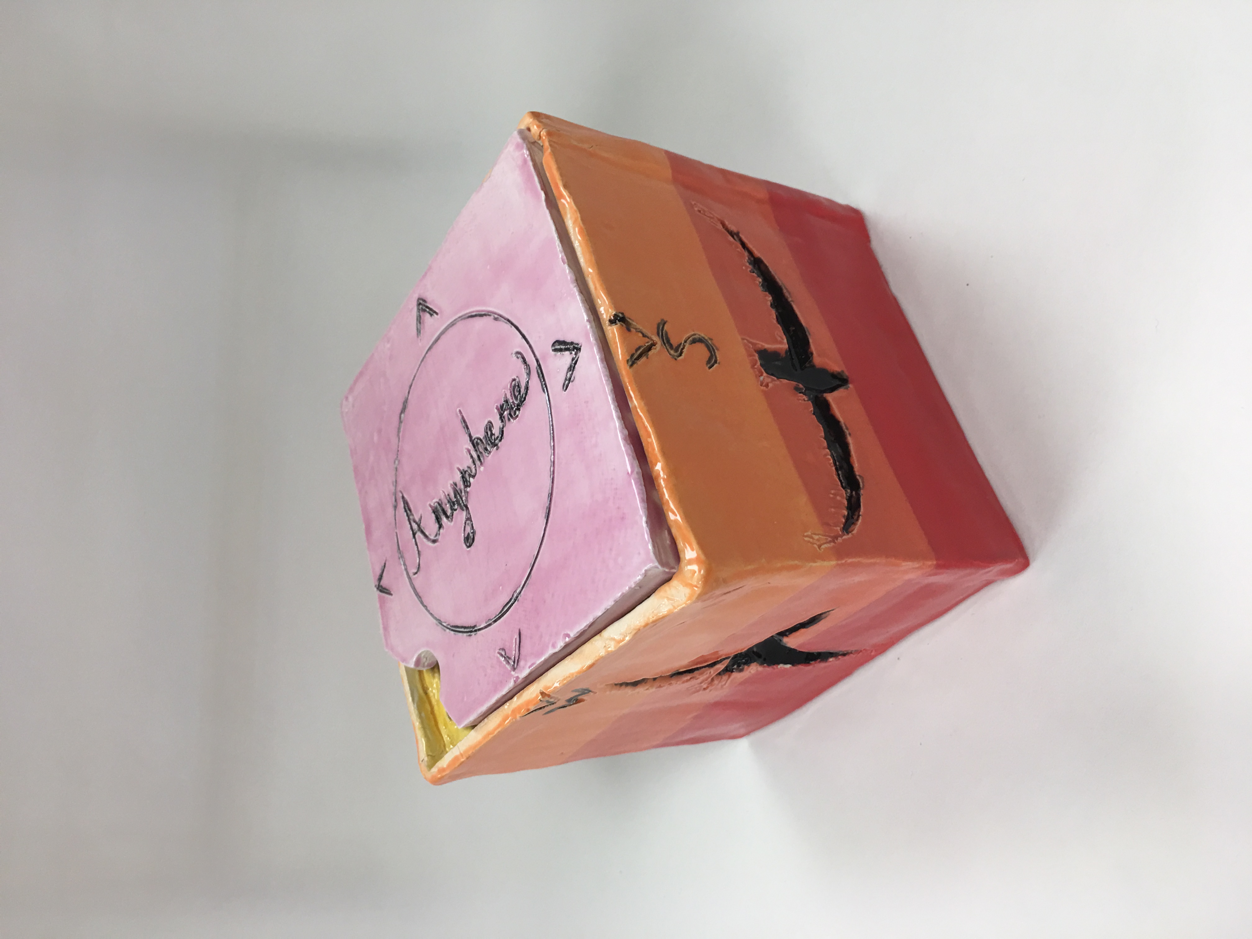 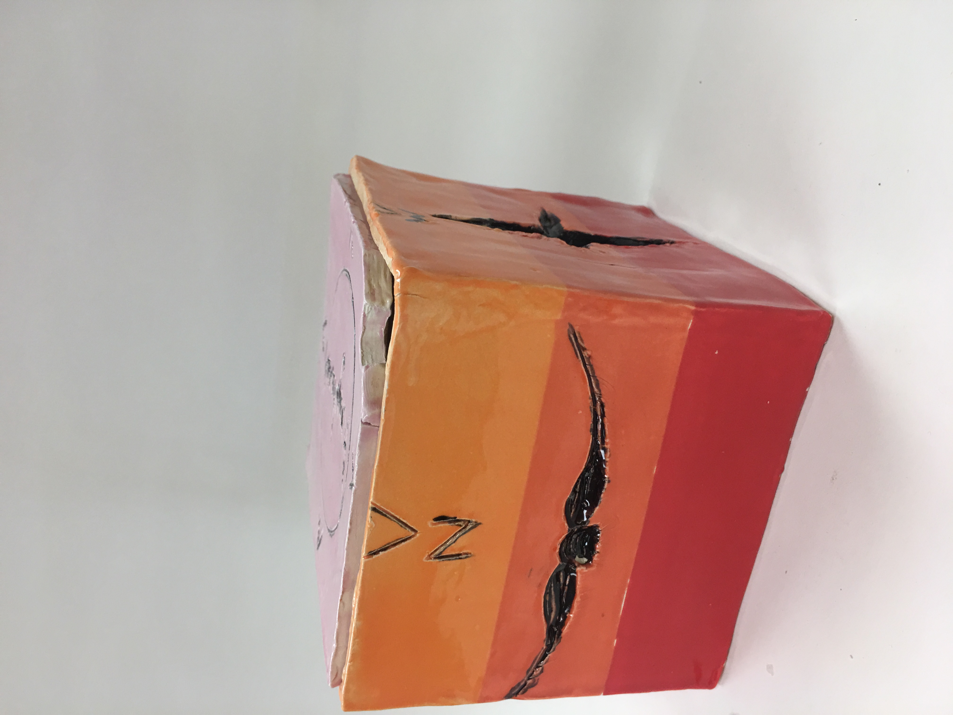 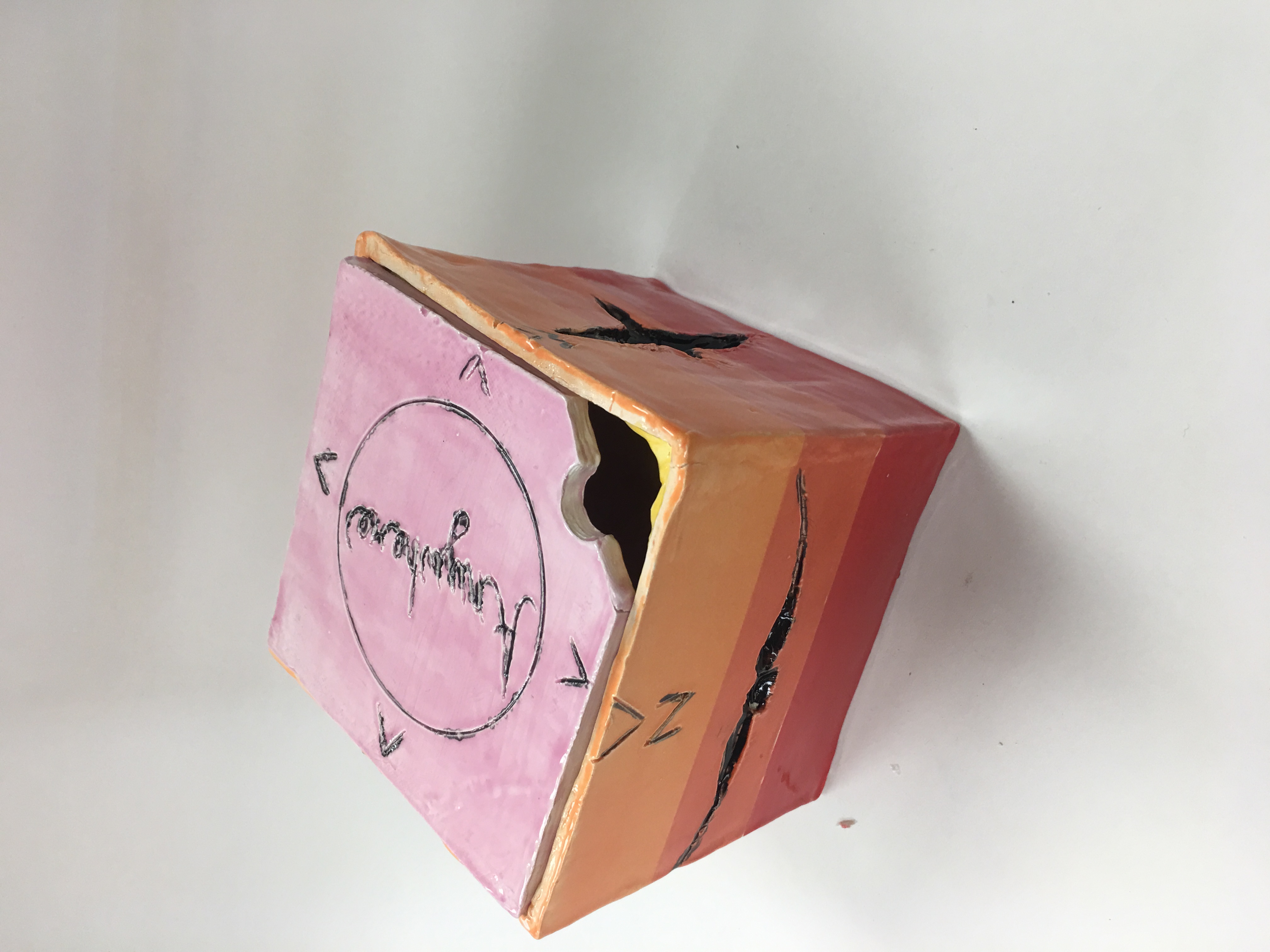 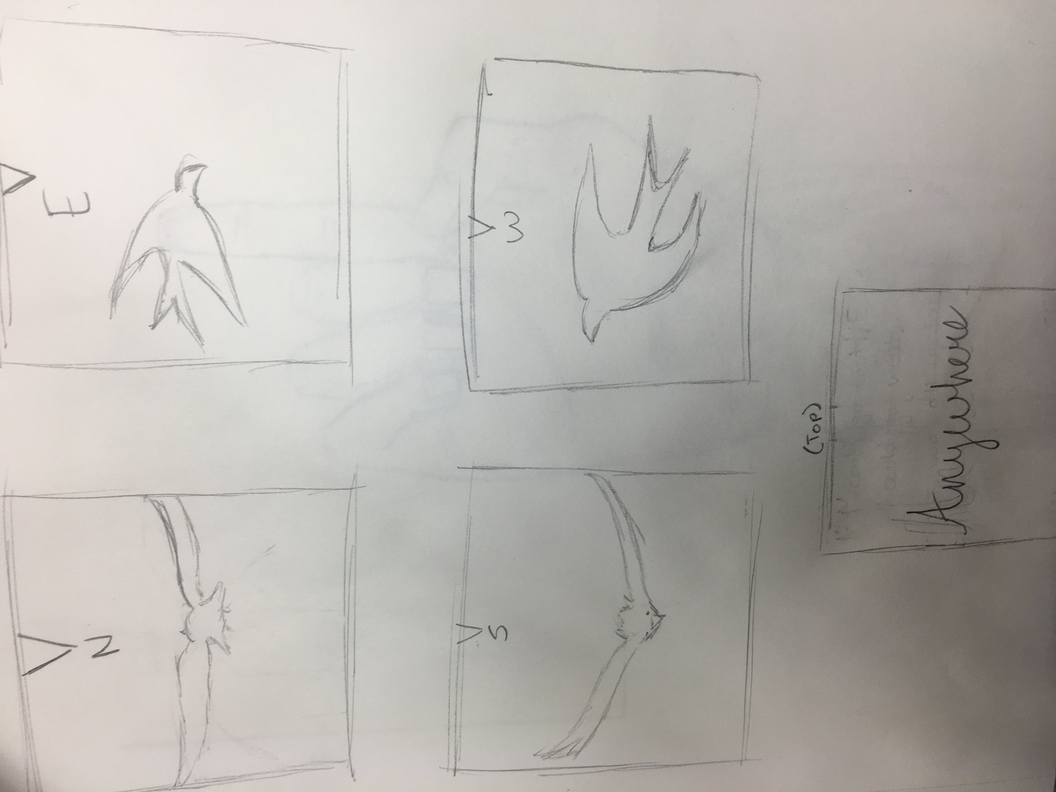 I created a clay box made from clay slabs. First, I rolled out my clay and cut it into six 5x5 squares. After I let these squares dry a little bit, I scored the sides and put the pieces together to create a box. After this, I used clay tools to carve designs in the clay, and then fired it for the first time. After this, I glazed the box and then fired it again. My inspiration for this idea was that when I was brainstorming, I was listening to the song "Roll Me Away" by Bob Seger. My favorite line in this song is "I could go east, I could go west, it was all up to me to decide." This inspired the compass kind of idea and then I added the birds flying different directions. The most successful part of the piece to me was the background glazing, as it came out clear and vibrant. Next time, I would spend more time putting the box together so that it does not crack in as many places. I would consider signing up for sculpture class! This was a fun project.
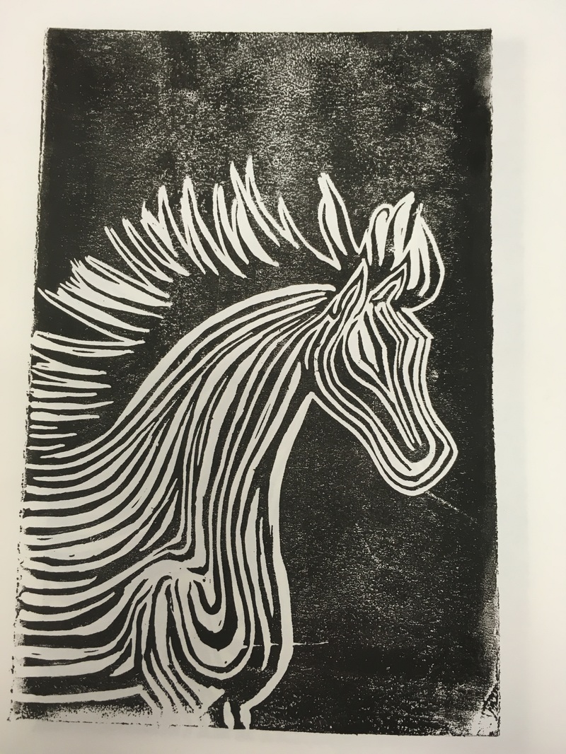 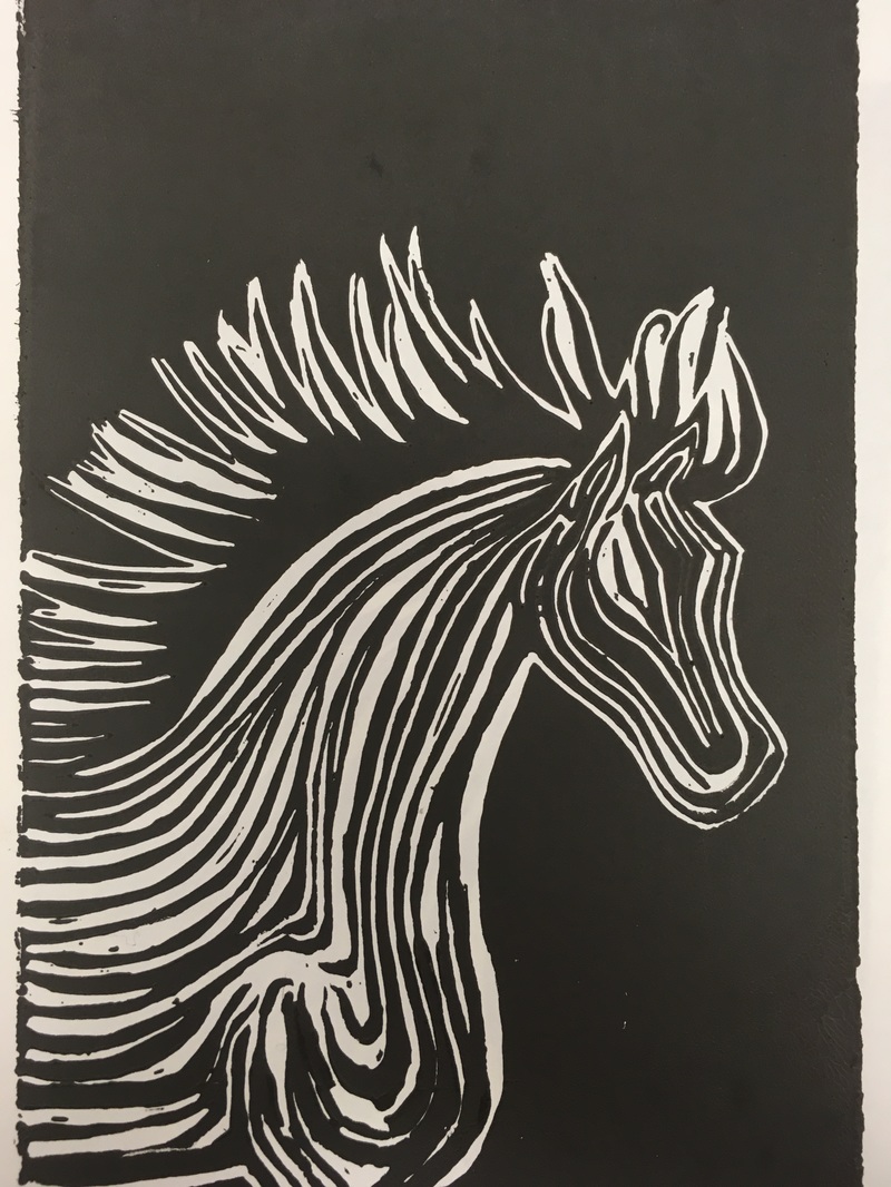 Doing the printmaking, I started with a basic drawing on paper. I then scribbled on the back of this paper in pencil and taped the scribbled side to my piece of rubber. I then traced over the drawing in sharpie on the piece of paper, and it bled through onto the rubber. I removed the piece of paper, and then traced the lines again. After there was a clear sharpie print on my rubber, I used a carver to cut out the white parts of my drawing. After this, I used ink to print the figure 5 different times. The photos above are my first print and my last print. I used the theme of line in my piece to detail the horse's body and add a sense of abstract imagination. I find this piece successful altogether because it is very detailed and clear, but next time I may want to add a background, although he black background helps the horse pop in the picture.
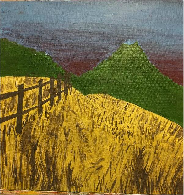 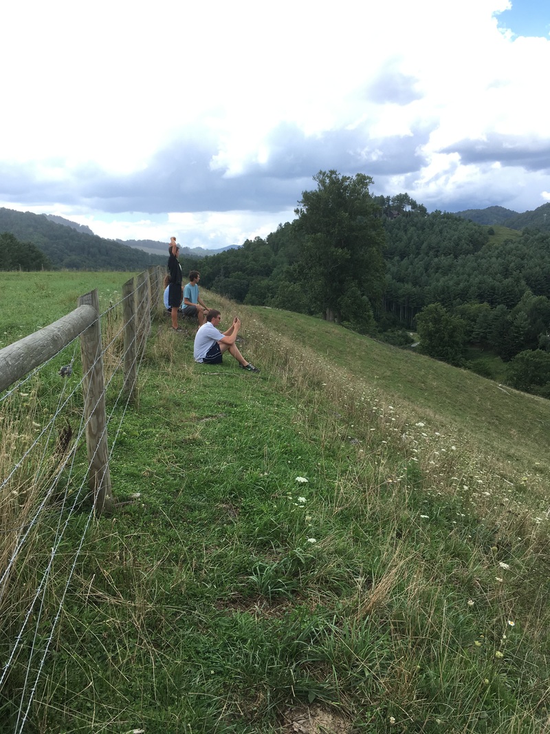 This piece is inspired by the outskirts of a town called "Sugar Grove." The reason this picture is so meaningful to me is that I consider this place to be one of my favorite places in the world. The day before I took the picture, in the same spot, and I watched as a double rainbow formed over one side of the mountains while a sunset shone on the other side. I chose to recreate the scene of the sunset. I chose acrylic paints because I thought that this would be the best way to make a colorful sunset. Unfortunately, I procrastinated this piece and when I did it at home I did not have enough paints or supplies in general to really work hard to make this piece look good. I used the four colors I had to create the brown and red colors. Next time, I will plan ahead and make sure I have enough time to complete the piece.
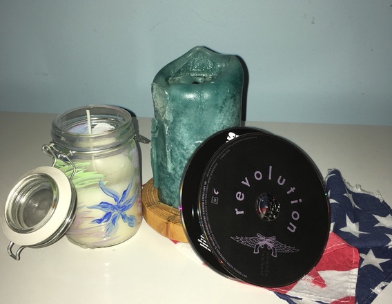 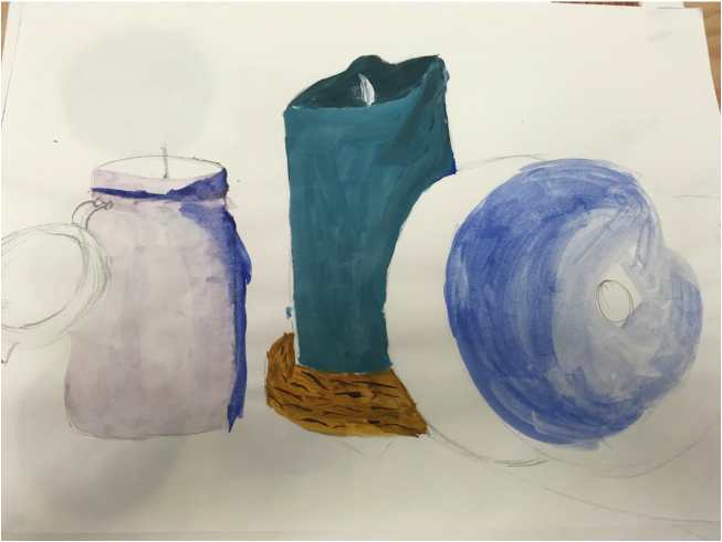 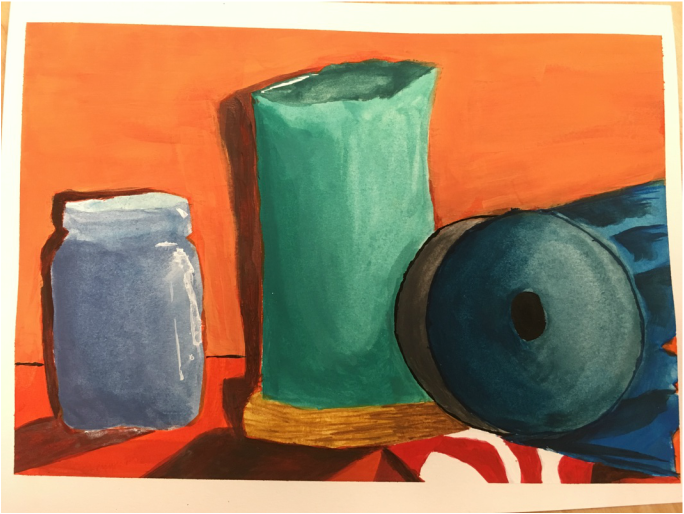 For this project (still life to represent ourselves), I chose candles, CDs, and my american flag bandanna. The candles simply show that I love relaxing when I get the chance and enjoying the small things in life (such as a softly burning candle). The candles are also used to symbolize my spirit. I sometimes view myself as a flame that is burning nonstop. I used the American flag bandanna to show my political involvement and general caring about the world around me. The CDs display my connection with music, and because I spend most of my time listening to music. The thing that is most successful about my piece is the shading of the candle, but other than that I am not really happy with the way it turned out. Although I chose watercolor because I personally enjoy it more, I believe I should have chosen acrylic so that I could make the objects look more solid. The background color, although chosen to contrast the blue, I feel takes away from the objects. Instead of bringing them out, it makes them look duller. I will go for a lighter color next time.
|
AuthorWrite something about yourself. No need to be fancy, just an overview. Archives
January 2017
Categories |
 RSS Feed
